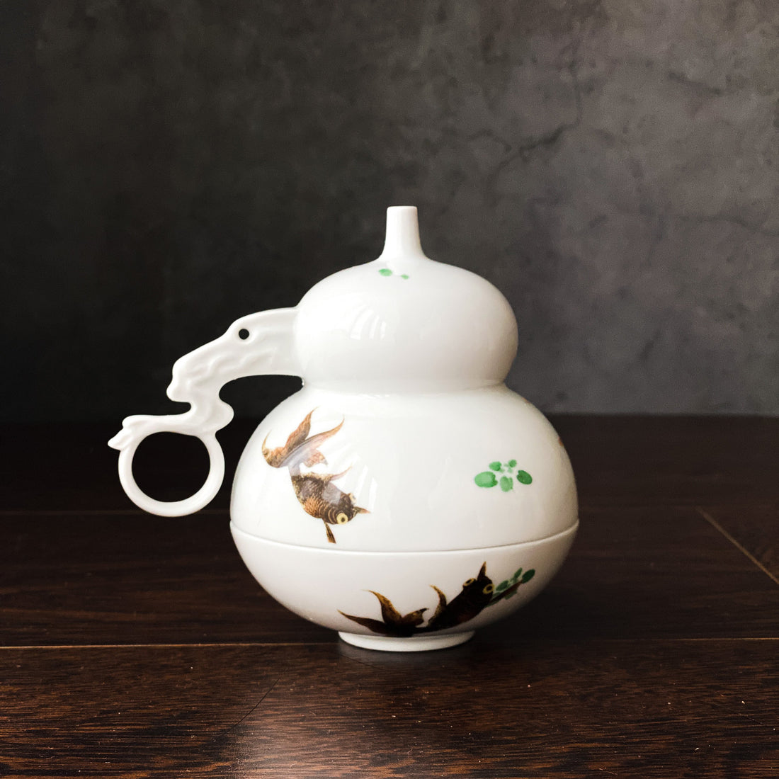
To drink, we begin with the essential—a vessel with the capacity to hold liquid. This is the unavoidable reality of function.
Yet as Wolfgang Ullrich suggests in “Not Just for Consumption,” “Beyond function, objects require fictional value…”
When it comes to cup design, this “fictional value” is precisely what deserves deeper exploration. It is the imagined, symbolic part that allows us to construct new narratives, new emotions, and new sentiments around the simple act of drinking.
Norbert Bolz, in “The Consumerism Manifesto,” adds:
Products once existed to satisfy needs—purely functional. Then came the era of design: seduction, visual appeal, and consumer desire. Now we’ve entered the age where consumers demand something more: “Change me.”
This is why the form and language of porcelain teapots and cups must be carefully sculpted—enriched with symbolic value, with layers of imagined meaning—so that the drinking experience becomes not just deeper in flavor, but richer in spirit.

Imperial Memories: A Fictional Grandeur
The name “Imperial Memories” was intentionally chosen to evoke an atmosphere of ceremony—a moment where the simple act of sipping becomes a grand occasion, as if one were drinking in the midst of a poetic historical drama.
Through the strength of its name and form, the piece encourages a heightened state of presence—elegance, reverence, and noble clarity. That, too, is fiction.
“Dukes,” “Empires”—these conjure images of divine-right hierarchies, a time when etiquette governed every gesture, and protocol defined one’s status. Such rigor, wrapped in mystique, gives even the act of drinking a certain gravity—a sensory weightiness.

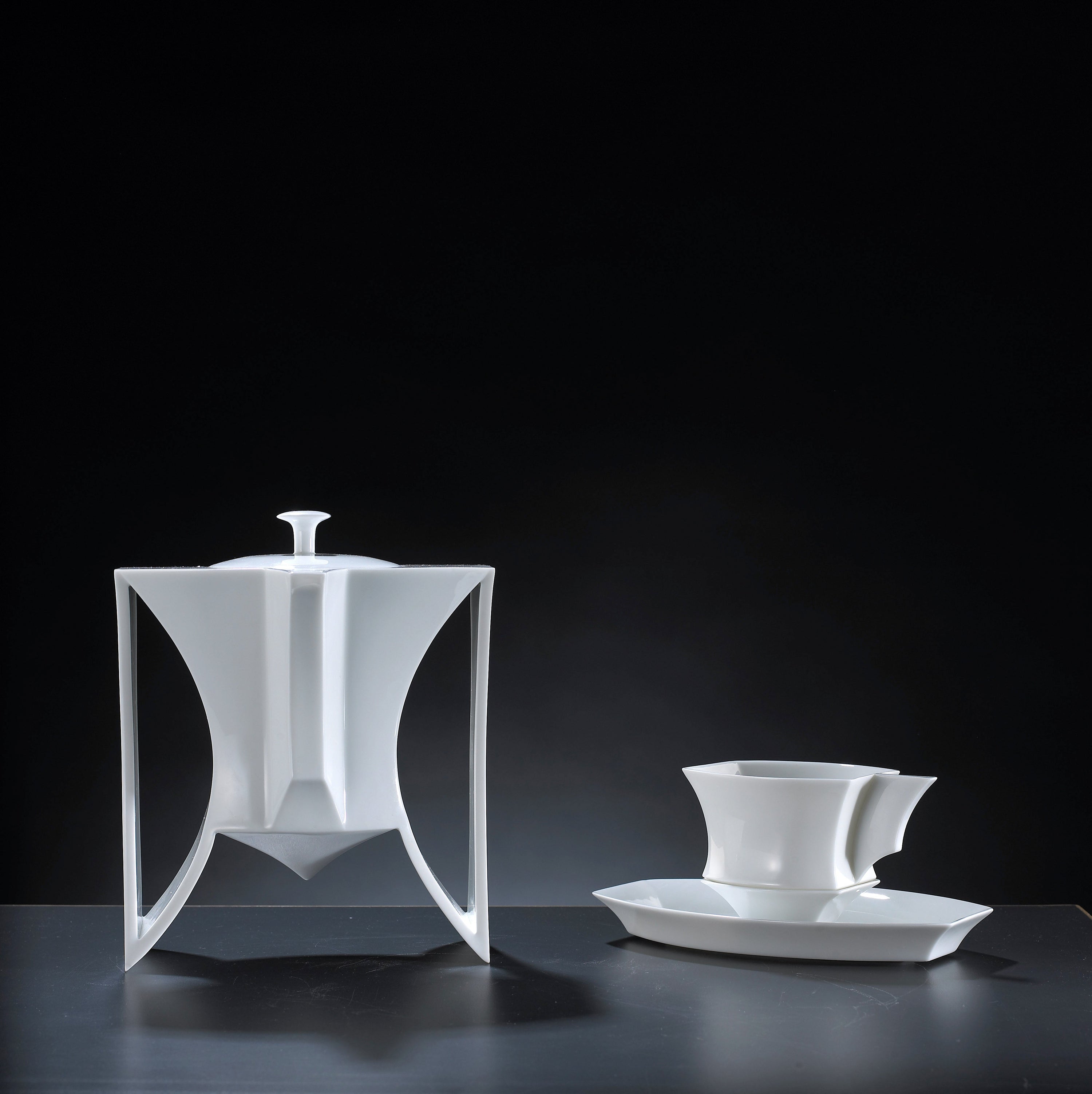
A Cup Designed for Ceremony
From the era of warring states two thousand years ago to the ritualistic bronze vessels of the Shang and Zhou dynasties—zun (for reverence), jue (for intrigue), ding (for majesty)—the Imperial Memories series draws on the visual genes of imperial grandeur.
The cup’s wide-rimmed, tapered shape with angular edges and segmented form echoes the architecture of empire—strength, hierarchy, power.
It even reimagines how the cup is placed. Rather than rest directly on a surface, it is paired with a base—just as in feudal times, every movement had its prescribed position.
A sip, then a deliberate return to its base—carefully, with composure. Even the placement becomes part of the ceremony. A choreography of respect.

Every Gesture Holds Meaning
The handle design is key.
Crafted as a flat panel, it visually commands attention. When held, it channels a sense of solemnity. The middle finger rests against the curve, supported delicately by thumb and forefinger. The gesture itself—poised and reverent—conveys dignity.
It is a stark contrast to the casual loop handles we see in conventional cup designs.
And almost unanimously, people say: “This feels dignified.”
The form changes you. Perhaps even your sense of taste begins to shift.

Layered Curves, Imperial Rituals
From the saucer to the cup to the base, layered arcs repeat across the vertical silhouette. These continuous curves embody the layered protocols of imperial etiquette—one nested within another—delivering not only visual harmony but a subconscious immersion into the aura of empire.
Form and symbolism interweave—shaping an aesthetic experience that’s not just seen, but felt. A quiet transformation takes place, inviting the drinker to step into a world where grandeur is not only remembered, but savored.